3 - Procedures for Visualization
The data was organized into three columns, the
first representing the X coordinate, the second, the Y coordinate and the last
column represents the velocity. Then the following DX network was used to
visualize the data. (see figure 4).
-
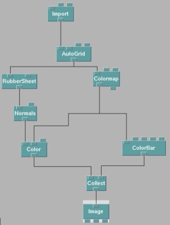
Figure 4 - OpenDX network
-
Autogrid was used for its interpolation of data, and its filling of missing
points. Originally, the density factor of Autogrid was at 1, this produced
large hexagons within in the visualisation. This was not desirable as we wish
to show that the vortex have distinct smooth edges. To overcome this, the
density factor was increased to 3. This required more data points, else
squares of missing points will appear on the visualisation. In order to
provide for these extra data points, I simply examined more frames to extract
more data. The missing points filled in by Autogrid were set to be -10, this
was to differentiate areas of zero dust movement and areas of no plasma.
Normals was used for its ability to further percept depth within the
visualisation. In order to add additional height differentiation of different
velocities, the base unit used for velocity was 0.1mm/s instead of 1mm/s. To
account for this, the scaling of the z display and the Colorbar has to be
adjusted to present faithful information on its scales. Rubbersheet was used
for its ability to create a 3D surface based on data values. Instead of having
discrete points, with the use of Autogrid and Rubbersheet, a continuous 3D
surface was produced.
The following is the general file used to describe the data.
file = /home/wtsang/Projectdata.txt
points = 601
format = ascii
interleaving = field
field = locations, velocity
structure = 2-vector, scalar
type = float, float
end