4 - Results
Figures 5, 6 and 7 are previous attempts of the visualization.
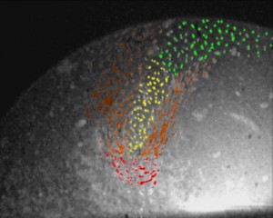
Figure 5 - This is the initial test run, or an estimate of the velocity map
base on the video footage.
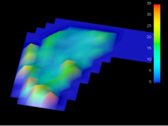
Figure 6 - This the result of Density factor 1 in Autogrid, at this stage,
only one frame of data points were used.
Figure 7 - This is done with data points of two frames, with Density factor of
3. The black squares show the area lacking data.
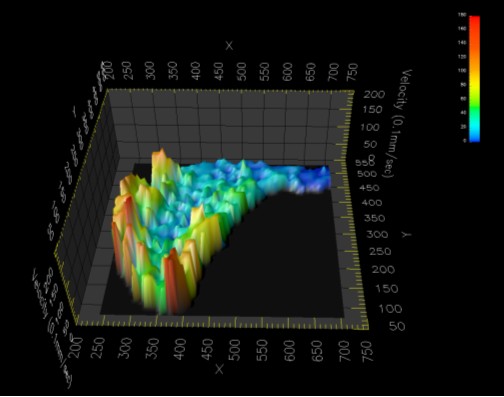
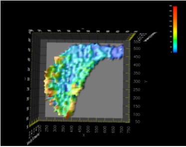
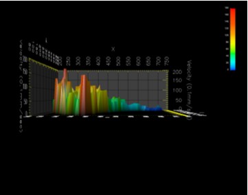
Figure 8
Figure 9
Figure 10
The figures 8, 9 and 10 are the results of the final visualization. As you can
see, the velocity map is expected, the region closer to the pin electrode
(coordinate 0, 350, 0) had higher velocities than of other regions. This is
because the pin electrode is the cause of the disturbance and hence its
effects are greatest closer to it. Like any other vortex structure (i.e.
tornado), the centre of the vortex had relatively low velocities, at points,
no movement at all.